 |
|
|
|
|
|
Techniques
| from the watercolorist Brigitte Charland. |
|
|
|
In this section you will find helpfull tips on watercolor techniques, transfer of drawings and on how to discover the specific caracteristics of each pigment and color mixing.
> how to recognize the hidden colour of a pigment,
> check out the mounting demo next.
> NEW a document concerning papers, their different uses, caracteristics and textures.
____________________
|
|
|
|
|
Click on mounting to see the step-by-step de mo of that framing technique without any glue.
|
|
|
|
|
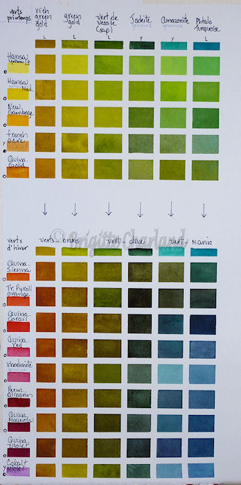
A technique of Mixing colors in a conscious maner and not improvised consists of creating a chart that you can consult to get to know all the hues of your palette. This one is of greens; the first square on top at left is created with the yellows vertcaly and the greens horizontaly, that makes the Spring chart, very warm.
The chart below at left, is made with the orange, red and pink colors mixed with the greens, this gives a cool, winter chart. Click on the photo to see the zoom image.
________________
|
|
|
|
|
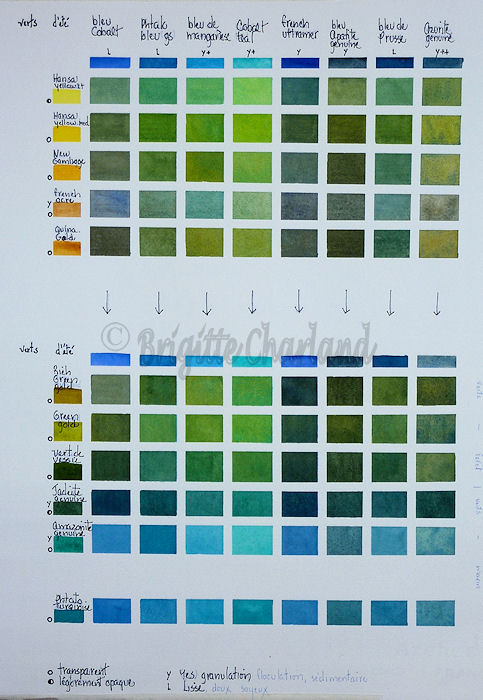
These 2 charts are made, the top one, from the yellows and the blues, the one at the bottom is made with the greens and the blues. This creates a full range, mature and more textured greens that make the Summer chart.
What you need to keep in mind when doing that, is to try to make a color that is center to both you are mixing, so the ratio of each will vary a lot.
____________________
|
|
|
|
|
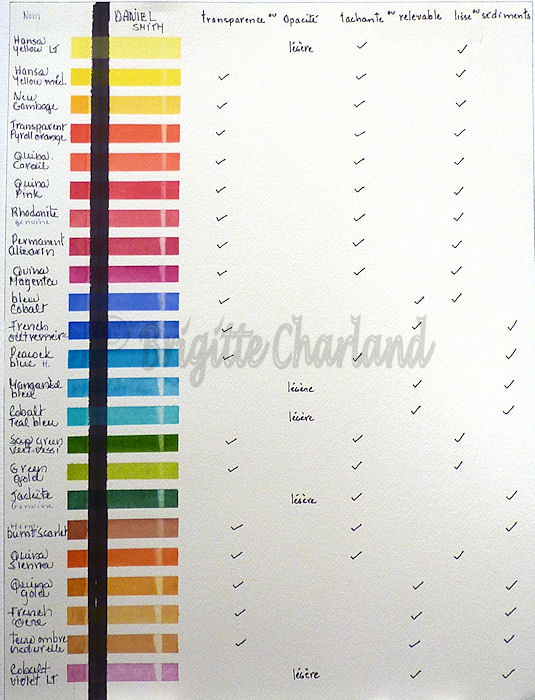
Here is a very easy chart to make but reveales a lot of informations on your palette. Draw a 1/2 inch black line with a permanent felt pen. Then, make a line with each of your colors over that black line. Dry, then try to remove a small line with a damp brush, bloth and dry.
You will discover if that color is stainting or liftable,
you will also discover if that color is smooth or sedemantry if it gives a rough looking surface.
You will also discover if that color is transparent or different degrees of opacity if it makes a veil on top of the black line. In one chart, you can discover all the caracter of each of your colors.
______________________
|
|
|
|
|
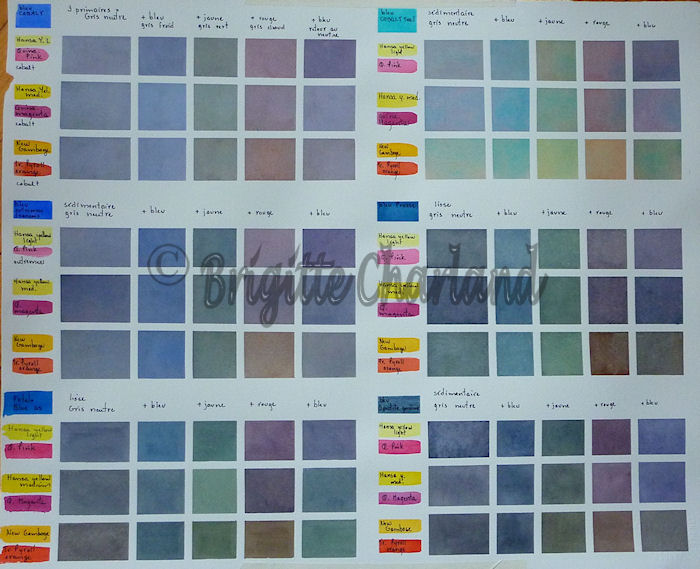
This is an exemple of a grey chart. I ahve greatly explored making grays because I do not like the greys you buy in a tube, I feel they are dull and opaque, and it is impossible to know with what pigments they are made of.
So I set out to practice making my own greys, either soft or textured, warm or cool but always luminous. I place great importance to greys because they serve the purpose to enhance the main colors.
Remember that a grey is made with all 3 primaries; blue, about 70% of the mix, red 20% and yellow 10%.
The exemple you see is made out of cobalt blue wich is not sedemtary so all the greys made with it, will have a smooth likeness.
> Start by making a "neutral" grey (first square at the left), then add a little more blue, you will have a cool blue-grey. Then, in that last mixture, add a little more yellow, you will have a cool green-grey, and if you add a little more red, you will have a warm brown-grey.
In the exemple, there are 3 horizontal lines with different greys. At every line, you alternate the yellows and reds to the cobalt blue to obtain different greys.
Now make the similar exercice with each and every blue you have in your palette! each yellow and ochre! each red, rose and violet!
BRAVO! you will get to be an expert in making personalized greys!
____________________
|
|
|
| recognize the hidden colour |
|
|
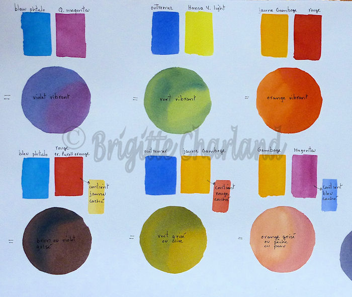
I am sure that when you will read the next explication, some of you will say "that's why I've been getting mud all the time".
In the left exemple, I mixed phtalo blue with quina (quinacridone) magenta wich is a cool violet, and got a vibrant luminous violet. But at the bottom, I mixed the same phtalo blue with red but I got a grayed down violet, very brown because of the yellow hidden in the red. All 3 primaries give a grey.
In the middle exemple, I mixed french ultramarine with Hansa yellow light (a cool yellow) and got a vibrant green. At the bottom, I mixed the same blue with new gamboge and got a olive grey-green because of the red hidden in the yellow.
At the right, I mixed new gamboge and red and got a vibrant orange, but at the bottom I mixed the same yellow but with a pink, wich has some blue hidden in it so it gave a peach color wich is a greyed down orange. But it the best mixture to make luminous soft skin tones.
______________________
|
|
|
|
Softening: is the hardest technique to master but also the most important one. It is the ONE that will make you progress and grow as an artist. You have to paint with 2 brushes at the same time; one to apply the color, and the other to touch the edge with water to soften that edge. The brush that touches the edge must be damp not wet; that means it has to contain clean water but not be fully loaded.
When you rinse that brush, you bloth it a bit but not completely. Not that easy to do... but it will make you loose that hard edge and create a soft edge.
____________________
|
|
| |
|
|
|
|
|
|